It seems impossible today, even if you are obstinately attached to paper, to ignore the possibilities offered by the web. At first sight, the internet is a low-cost platform that potentially allows you to reach anyone in the world. And thus, it seems that any project could have an echo that just a few years ago was absolutely unimaginable.
A project like the Le Petit Néant could not exist without the internet, even if it is primarily a printed magazine. The contact with the artists, for example, is done mainly via Facebook and Flickr. Without these tools, it would have been much more difficult to contact them. Without the internet, we would have used conventional means of distribution such as newspapers, advertising, presentations and exhibitions, and of course word of mouth. This would have increased the cost and required more effort and energy we could not have not dealt with.
Let’s explore the digital “life” of Le Petit Néant through screenshots of its web presence to see how the space of the internet is being used in parallel to that of the printed page.
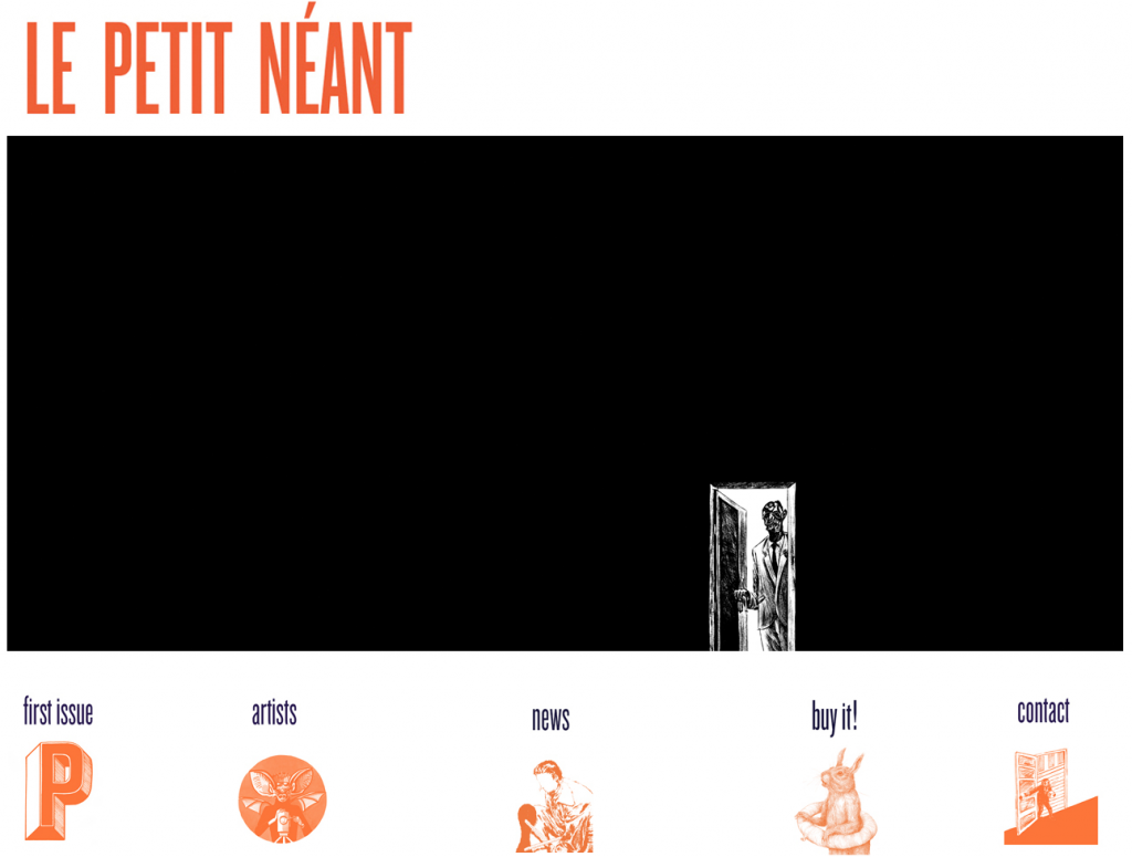
1. The Website
The website follows a very standard structure, e.g. presentation of the project, artist bio, news, links, contacts and a paypal link to order the publication online.
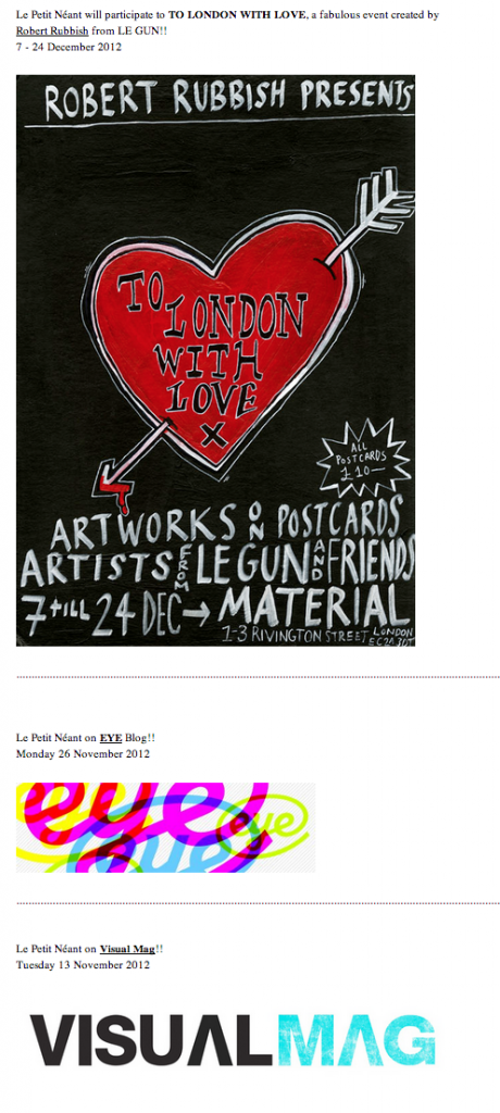
It contains basic information and is only updated to convey general information about the overall activity of magazine, with little interaction allowed to the audience.
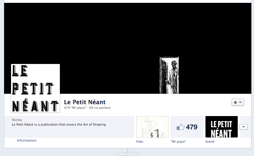
2. Facebook
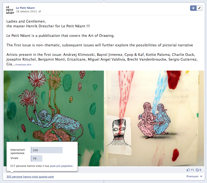
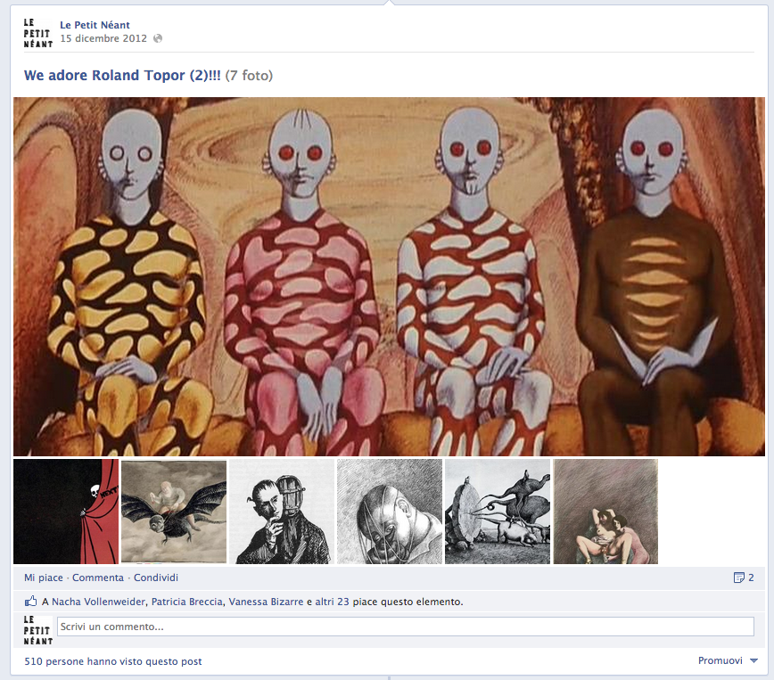
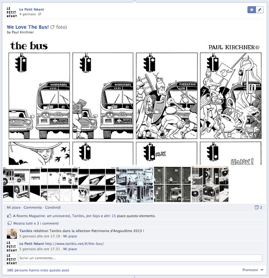
Unlike the website, the Facebook page is updated several times a week. Its main function is to expand the audience by posting events and presenting the work of the artists featured in the publication. Its purpose is to promote the artists or introduce new ones to the public as well as providing snippets of their work.
The Facebook page also presents works by artists who are not featured in the publication. We do this just for pleasure. However, it attracts new visitors who have similar tastes and iterests and who we might not be able to attract via the the publication.
Bus by Paul Kirchner
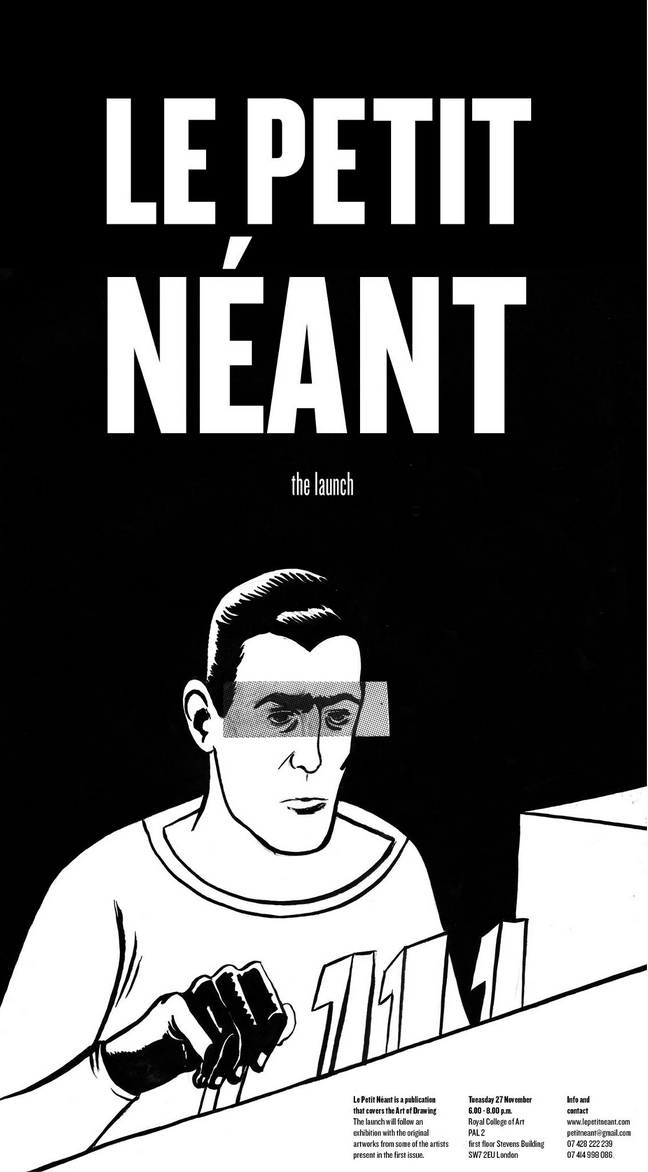
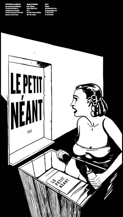
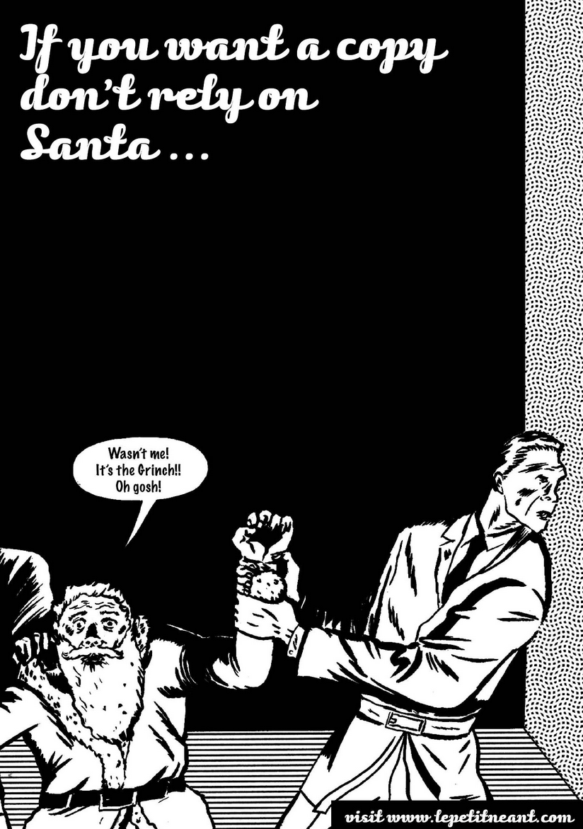
We consider this space a kind of “extension” of the magazine, a tool for keeping the attention of the audience alive. We also use drawings created specifically for the page, a space of social promotion. Below are some examples.
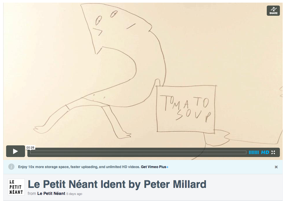
3. Vimeo
Recently, we have created a Vimeo channel, for wich we invite animators or filmakers to imagine small idents for Le Petit Néant. The format of these works draws on that of the well-known MTV videos of the 80’s and 90’s. But through this initiative we are able to observe how a printed drawing magazine might inspire creators working with other media, see for example “Tomato Soup” by Peter Millard, an artist working with animation recently graduated from the Royal College of Art, London (UK).
The different time and content of the “digital life” of LPN complement the activity of the publication, creating a flux of new content and information that expands on the annual printed publication.
That said, the idea of Le Petit Néant would not exist without the printed publication, because it only make sense as a whole. In the magazine, the narrative is created page after page, through the encounter between the images. When one separates the images the rhythm and the continuity are lost, so it is the narrative. This is what happens in the Facebook page, for example, where the drawings are presented individually.
The artists included in the publication work primarily with ink, paint, printing techniques, or animation. We do not look for people working with the web, or digital tools as such. However, because nowadays these artists are all used, like myself, to seeing their work in digital format, the various internet spaces mentioned above are considered as potential spaces and tools for extending their activities. These spaces are not seen as an alternative reality but as a complementary dimension.
Today the publishing industry seems to be moving towards digitization. At least this is the general perception. And perhaps in the near future all drawing publication will be exclusively online. But we decided to take a different route, against current trends. When working on the first issue of LPN we were thinking about the pages, the paper, the binding, the smell of ink. We had a fixed idea: to produce a physical object in which to create a narrative. But we did so while keeping a watchful eye on the possibilities offered by the digital age. At present, we just consider them useful tools.
